


Pie Charts
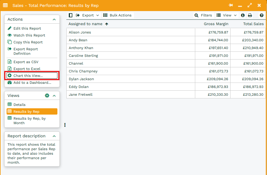
To generate a Pie Chart you will first need to create a report that can be broken down into segments easily, such as the Template Report, Template – Sales – Total Performance, which shows monthly or individual Sales performance from won Opportunities.
Once you have run the report you can Chart this View, selecting this will generate a new window.
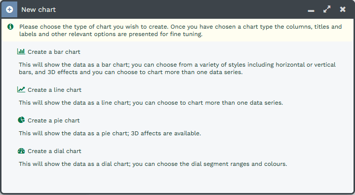
Select the Create a pie chart option.
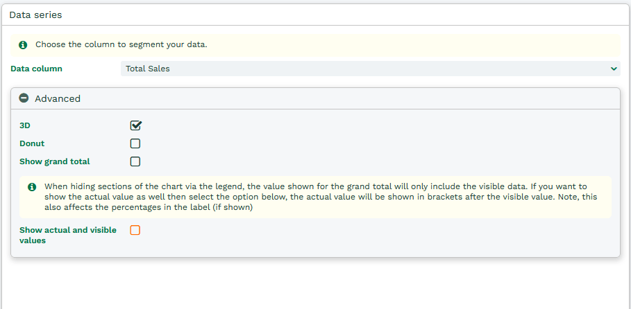
Data Series
Data column – Select the column from the report that you are going to be segmenting.
Advanced
3D – Display the pie chart as three dimensional rather than two.
Donut – Turn the pie chart into a ring donut instead.
Show grand total – Creates a box that displays the total of all the data in the chart, which is positioned under the horizontal axis. The Grand Total displays the total of what is visible on the chart, so if filters are applied the Grand Total will change accordingly.
Show actual and visible values – If you have the Grand Total shown on the chart and want to display what the overall total is at all times, regardless of the filters applied, then this setting needs to be enabled.
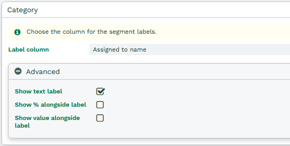
Category
Advanced
Show text label – This changes whether each of the segments in the pie are labelled from around the edge allowing you to see exactly which value segment is which.
Show % alongside label – If the text label is enabled then it can also be accompanied with the percentage value of the chart that it possesses. If a filter is applied in the legend to remove segments, the percentage value will change accordingly.
Show value alongside label – if the text label is enabled then it can also be accompanied with the actual value that is generated by the report column.
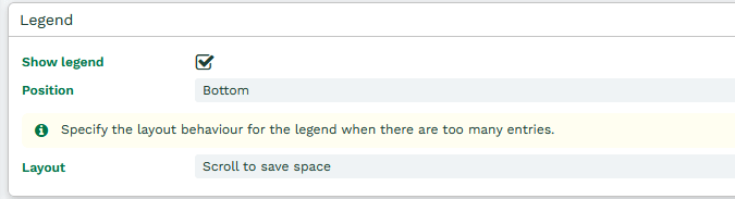
Legend
Show legend – Enabling the legend creates a box on the chart informing you what each coloured column represents from the report. The legend can also be used to hide segments from the chart for more detailed comparisons.
Position – The legend can be placed around the the chart; by default this will be set to be positioned under the chart but can be moved to either be above or to the left or right of the Chart instead.
Layout – The legend can either be wrapped so that all of the values appear in the chart window, however this may mean that values appear over multiple lines, reducing the size of the chart. Alternatively, they can be set to a single row and you will have the ability to scroll offscreen to find the required value.
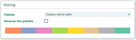
Styling
Palette – Choose from a number of colour palettes, this will determine the colour in which the bars will appear in.
Reverse the palette – Bars will be coloured in order of the palette; if you do not want to use the first colour you can reverse the palette and use the final colour instead.