


Our Approach to Accessibility
Our approach is aligned with the Web Content Accessibility Guidelines (WCAG) 2.2 Level AA, and we continuously work to improve in accordance with these standards. This ensures Workbooks is usable by a wide range of users, including those with visual, motor, and cognitive impairments, as well as those using assistive technologies or mobile devices.
Perceivable
Content is designed to be clearly presented and adaptable for different needs:
Font Sizes & Spacing
Rich text fields display text in the default font size of the current theme, and when used in Email the appearance will follow the default font size of the recipient’s email client. Users can still adjust text size and spacing using built-in preferences (via Start > Preferences > Look & Feel) to make reading easier and more comfortable. We ensure that icons and interface elements remain properly aligned and centred as the page scales or when font size changes, preventing clipping or misalignment. This helps maintain a consistent and readable layout across different devices and user settings.
Responsive Design & Reflow
Workbooks automatically adjusts to different window sizes, screen resolutions, and zoom levels (up to 400%), ensuring content remains visible and easy to use on a variety of devices, from large desktops to small tablets and phones.
When space is limited, menus and toolbars intelligently collapse into simpler, more compact versions, making navigation straightforward without overwhelming the screen. For example, complex filter panels and multiple menu rows adapt by opening in separate windows or collapsing into menus, so you always have clear access to the features you need.
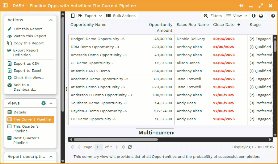
All views, including grids, cards, calendars, and maps, resize and rearrange automatically to maintain readability and usability. While some advanced features are best experienced on larger screens, the interface prioritizes core functions to ensure a smooth experience on smaller displays.
Screen Reader Friendly
Our platform is accessible to users of screen readers and other assistive technologies.
Interactive elements such as buttons, menu items, and checkboxes include clear and descriptive labels. This allows screen readers to accurately announce what each element does, whether it’s opening a menu, toggling a setting, or saving a change. Checkboxes clearly indicate whether they are checked or unchecked, and navigation items announce when they are selected.
Headings and labels are structured so that screen readers present content in a logical order without affecting the visual layout. Where certain visual elements don’t carry meaningful information, we’ve ensured they are hidden from screen readers to reduce noise and distraction.
Colour Contrast
We understand that colour alone isn’t always enough. Text and background combinations throughout the platform meet or exceed minimum contrast requirements to ensure readability for users with visual impairments.
To further support visual accessibility, we offer a high-contrast pattern-based palette for Bar and Pie charts. Instead of relying only on colour, this option fills each segment with distinct black-and-white patterns, making it easier to distinguish chart elements without depending on colour perception.
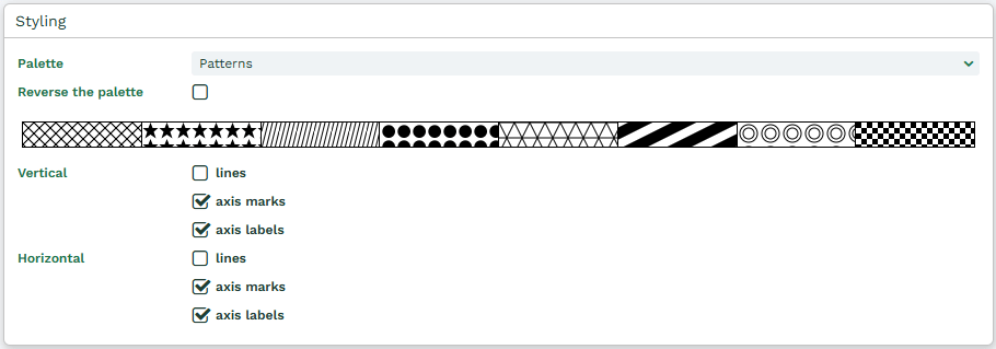
Legends and labels are updated to reflect these patterns, and outlines are added to ensure every element remains visible. The pattern palette is supported across multiple chart types and themes, including dark mode, and is also reflected in scheduled reports.
For custom records a custom icon and colour can be applied to tabs, offering both flexibility and personalisation while keeping contrast considerations in mind.
Operable
The platform supports full navigation and operation through multiple input methods:
Keyboard Navigation
Keyboard navigation is fully supported across the platform. You can move through key interface elements and perform important actions such as opening menus or closing windows using only the keyboard.
All core features are accessible via keyboard, including single-screen workflows. This includes:
- Accessing the close button and other tools in the window header.
- When navigating via keyboard, borders and highlights show where your focus is.
- Even when space is limited and the menu has been collapsed, window icons will update visually to help you understand where to find things.
- When you hover over an icon, a small burger menu indicator will appear to show that additional options are available.
Tab Navigation
Keyboard navigation for tabbed content is designed to be predictable and accessible:
- Moving between tabs with the keyboard does not change the page content until Enter is pressed, preventing accidental changes.
- Focused tabs show a clear outline to indicate which one is currently selected.
- Clicking or tapping a tab updates the page content immediately.
- When navigating to an off-screen tab, the tab bar scrolls to bring the tab into view once it is activated.
Character Key Shortcuts
We’ve introduced key shortcuts for commonly used actions. For example, pressing CTRL + S will open the Start menu allowing you to search, allowing for faster, more efficient navigation.
Clear Focus & Titles
Each window is consistently titled and includes visible focus indicators. These guide you through the interface and help keep your place while navigating. Screen reader users will also have the title of each window announced before the menu button to ensure text is introduced in a logical order.
Labelled Buttons
All interactive elements, especially buttons, are clearly labelled and accessible to screen readers. Examples of labelled buttons include the Start Menu, Notifications, and View menu icons, as well as window tools like minimise, maximise, and close, all of which now include clear tooltips such as “Minimise this window.”
Understandable
The interface is designed to be intuitive, consistent, and easy to use for everyone.
Plain Language
- We use clear, straightforward language across the platform.
- Terminology is consistent and free from unexplained abbreviations or jargon.
Consistent Navigation
- Layouts and navigation behave predictably across the product.
- Common interface elements are placed consistently to help you know what to expect as you move through different areas.
Clear Visual Hierarchy
We organise information using consistent headings, spacing, and visual styles that guide your attention naturally and reduce cognitive load. Buttons, links, and other interactive elements are designed to stand out clearly, so you always know what actions are available and what they will do.