


Worked Example – Changing the Map Pin Colour and Size based on a Person’s Job Title
This page will show you how to change the colour and size of the Map Pins based on a Person’s Job Title. The same concept could also be applied to show you the Industry of an Organisation, or the Status of a Sales Lead.
Step One: Create a Report based on People
Navigate to Start > New > Report > Pre-populated Report > People. Add a title and description and save your Report.
Within the Details tab, add the Column “Map Position”.
Step Two: Create a Calculated Column
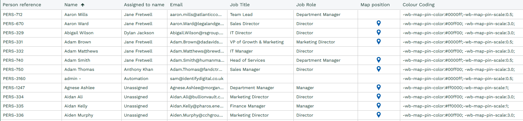
Now create a calculated column entitled “Colour Coding” using the following CASE Statement:
CASE
WHEN person_job_role = ‘Director’ THEN ‘-wb-map-pin-color:#00ff00; -wb-map-pin-scale:2.0;’
WHEN person_job_role = ‘Manager’ THEN ‘-wb-map-pin-color:#ff0000;-wb-map-pin-scale:1;’
ELSE ‘-wb-map-pin-color:#0000ff;-wb-map-pin-scale:0.5;’
END
This will output a new column that looks like the below:
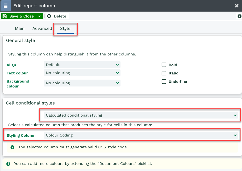
Step Three: Apply the CSS Styling to the Map Position Column
Now you’ll need to add the Colour Coding column to the Map Position as CSS Styling. To do this open the Map Position Column and click on the Style tab. Under Cell conditional styles select “Calculated conditional styling” and in the Styling Column select Colour Coding:
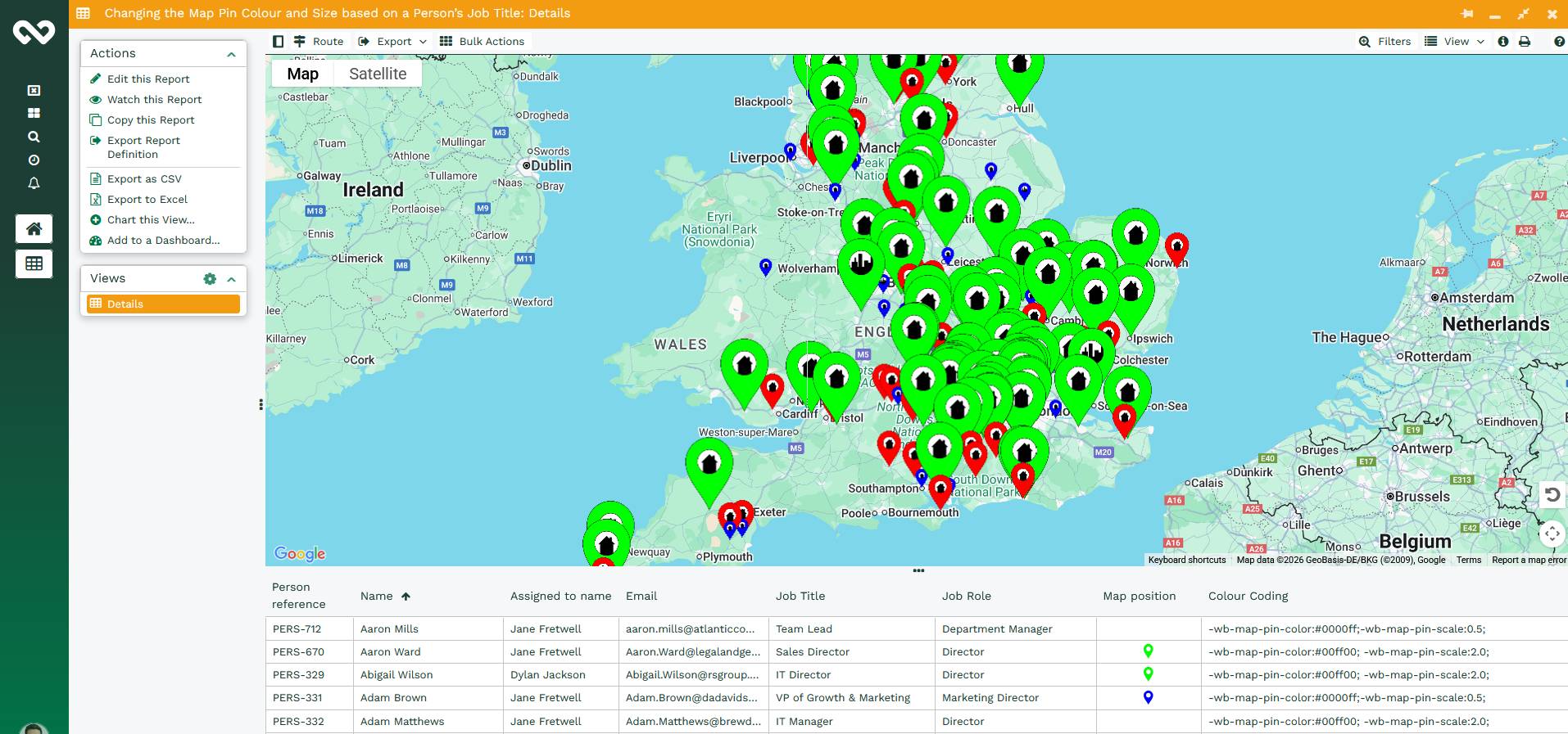
Step Four: Save and Run the Report
Save & Run the Report. This will generate the Report in a standard grid view, however you should notice that the Map position pins have already changed colour. If you then change the view to View as Map or View as Map & Grid you will get something similar to below.
Step Five: Share this Report with those that will be using it
By default, the report will only be shared with the Users that are a member of the System User Group. To share with a wider audience, use the padlock icon in the top right corner of the report editor. You can find more information at Sharing Reports page.