









Adding Custom CSS to the Event Portal
You can apply custom CSS to the Event Portal, either for all Events through the Event Portal parameters, or for a single Event from its Event record. The Event Portal is built on Bootstrap 4, so if you’re uploading your own CSS, you’ll need to make sure it’s compatible. If you don’t already have a Bootstrap 4 CSS file you can use, the sections below explain how to create, store and apply one.
Sample File
We’ve created a sample SCSS file designed specifically for the Event Management Portal, which you can download here. You can change the color names used in the file, then compile it into a CSS file.
Instructions on how to compile the SCSS file into CSS are in the comments at the top of the file.
How should I store my amended CSS File?
Once you’ve downloaded and amended the sample file, we recommend storing it in the Workbooks Upload Library. Make sure the public resource checkbox is checked, otherwise the CSS will only be available to Workbooks users.
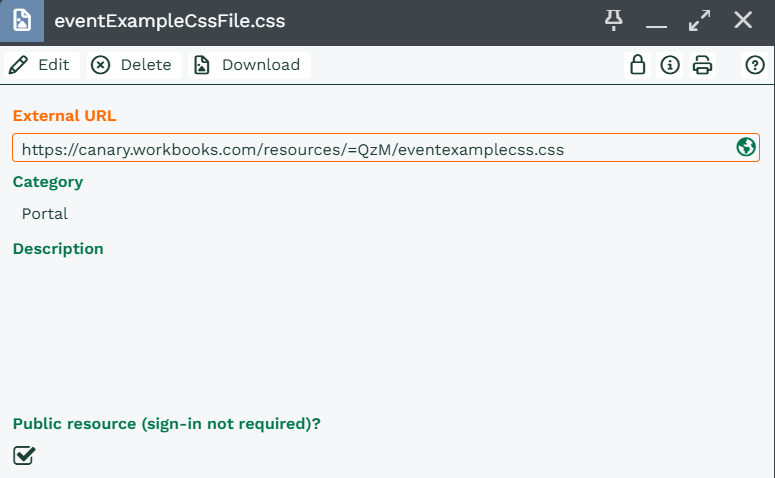
When you upload the file, an External URL is generated. Where you enter this URL depends on how you want to use the CSS:
- For all Events: enter the URL in the Custom CSS parameter in the Event Management plugin.
- For a single Event: enter the URL in the Custom CSS field on the Event record.
Additional Changes to the Event Management CSS
Below is a breakdown of the elements in the Event Management Portal and what you can change with your CSS file. This lets you match the look and feel of your website, so moving from your site to the Event Portal feels seamless for attendees.
General layout
Screen width
.container controls the width of the content. It uses @media queries to set the max-width based on the width of the browser.
Buttons
.btn: generic properties.btn-primary: buttons like ‘Register’ and ‘Continue as Guest’.btn-outline-info: buttons like ‘Events’ in the navigation menu at the top of the screen.btn-info: buttons like ‘Biography’ in the Speakers section of the event details page.btn-success: buttons like ‘Checkout’ and ‘Confirm’
Navigation menu
This covers the navigation bar at the top of the screen, as well as the event navigation (Select Tickets, Order Details, etc.).
.navbar-light .navbar-nav .nav-link(anchor tags): mostly used in the event details, but also for the guest/user button.navbar-light .navbar-nav .active > .nav-link: sets the active item when registering for an event
The light gray background is defined by the bg-light class. This class also defines the alternating sections when showing the details for an event.
Page header
The “Upcoming events” title, and the name of the event on other pages, use an <h1> tag, which can be modified. The black border that’s added when there’s a banner image isn’t currently configurable.
On a page for a specific event, the date and time use an <h3> tag, which can be modified. This also has the subheader class, but as above, the black border can’t be changed.
Compliance statement
The background color is defined using the footer class.
Alerts
Alerts within the process use the following classes:
.alert: generic properties.alert-success: the green text, background and border colors shown for success messages.alert-danger: the red text, background and border colors shown for error messages.alert-info: the blue(ish) text, background and border colors shown for information messages
List of all events
The dates in the timeline use the following classes:
.badge: generic badge properties.badge-pill: defines the curved ends.badge-primary: sets the colors
The timeline calendar icons use the following classes:
.timeline-point: generic properties.timeline-point-primary: sets the colors
The events within the timeline use the following classes:
.timeline-event: the container that defines the background, border details, etc..timeline-heading: the element that contains the banner logo.timeline-body: the element that contains the link to the event.timeline-footer: the element that contains the event date
The connector between the calendar icon and the event is styled using the class path .timeline .timeline-item > .timeline-event:before.
Note
All of the timeline-prefixed CSS classes are defined within the page itself, so any overrides may need more specificity to take precedence, for example:
#main_content .timeline .timeline-item > .timeline-event { border: 1px solid green; } #main_content .timeline .timeline-item > .timeline-event:before { border-left-color: green; border-right-color: green; }
Event details page
General styling
Each section is defined using cards, which use the following classes (all nested within each other):
.card.card-body.card-title
Note
These cards also use the border-0 class to turn off the border at this top level. Other cards within the page will have a border, as defined by the card class.
The title uses an <h2> tag as well as the card-title class.
The light gray background on alternating sections is defined by the bg-light class.
Agenda section
The table here doesn’t have any specific classes set, but you can style it using the parent agenda ID, for example:
#agenda table { ... }
#agenda table td { ... }
Speakers section
Each speaker is defined using a card (see above), with the addition of the card-footer class, which styles the gray bar underneath the card. This is actually black at 12.5% opacity, which simply darkens the footer.
The speaker image style is controlled by the speaker_img class. As this is defined within the page itself, any overrides may need more specificity to take precedence, for example:
#speakers .speaker_img { ... }
#speakers .speaker_img img { ... }
The speaker info is defined within a speaker_info class and uses <h5> tags for the names and <small> for their details. As with speaker_img, overrides to this class need more specificity.
The buttons in the speaker cards use btn-info, as defined above.
The link buttons in the card footer are anchor tags that can be styled using the card-link class.
Venue section
The information, address and directions are displayed using cards, with the following classes in addition to those mentioned above:
.card-group: controls how the three cards sit together on one line.card-header: defines the gray bar above the card. This is actually black at 13% opacity, which simply darkens the header.
Sponsors section
Uses cards with no borders.
Select Tickets page
The table of available tickets/products uses the following classes:
.table.table-sm.table-striped
These three classes are used together with the appropriate child HTML elements to style the table, including striping the rows.
Order details
Uses cards and bg-light for the layout.
The item count in the cart is defined as a badge (see List of all events), but this one uses the badge-info class to set the colors.
Confirmation / Payment page
The Customer and Event details are defined using cards.
The Customer card uses the text-white and bg-info classes, which set the background color and white text (with the header being 13% opacity black over the top).
The Event card uses the text-white and bg-secondary classes, which set the background color and white text (with the header being 13% opacity black over the top).
The tickets/products table is styled the same as on the Select Tickets page.
The payment button uses the btn-info class.
Attendees page
The individual attendee forms are defined as cards (see above).
The cards also have the border-info class set to color just the border, and use the text-white and bg-info classes to color the header.
Once the attendee details have been entered, the header uses the bg-success class to set the background color, which is what turns it green.